You are using an out of date browser. It may not display this or other websites correctly.
You should upgrade or use an alternative browser.
You should upgrade or use an alternative browser.
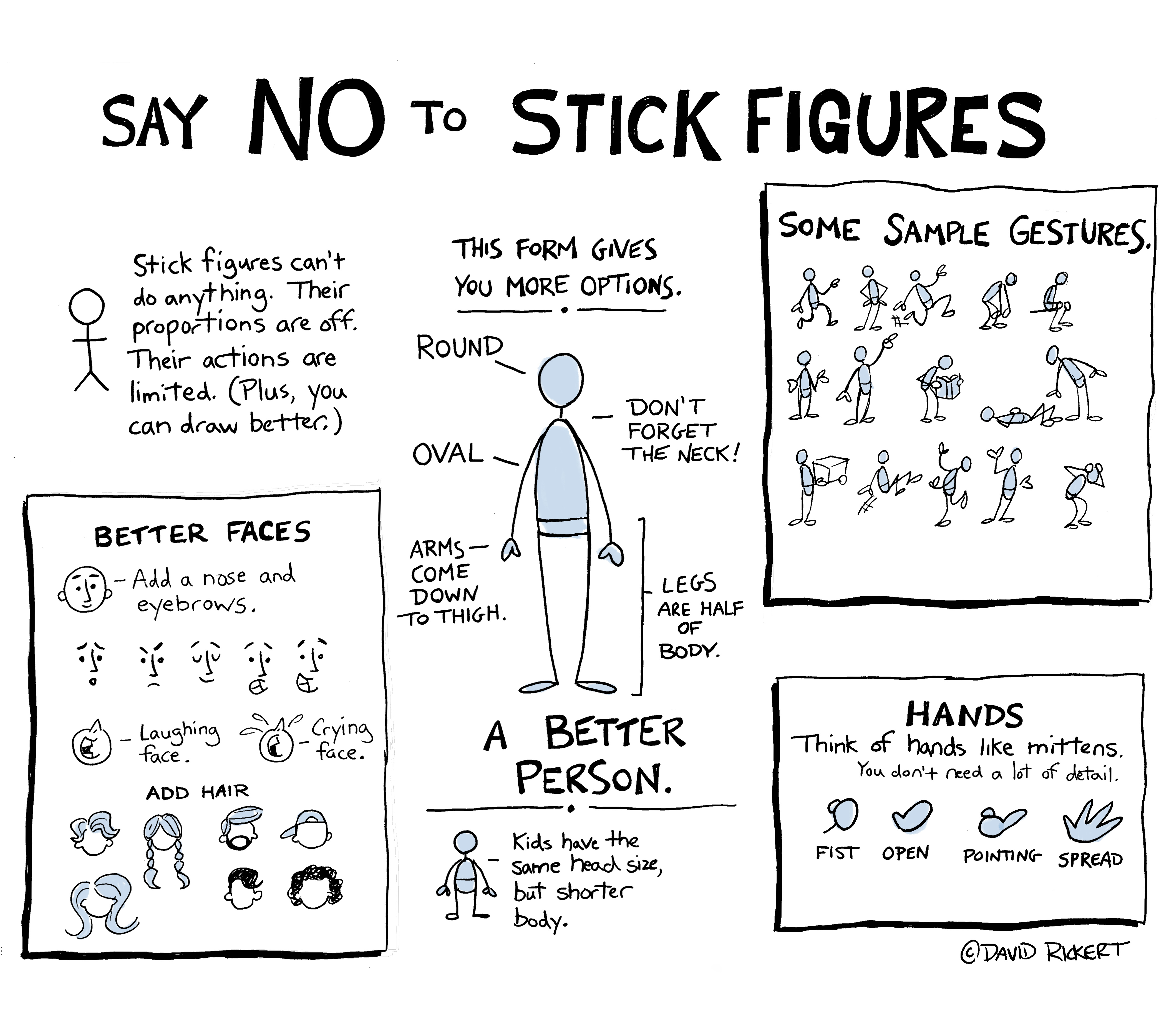
Say NO To Stickfigures
- Thread starter leogames2012
- Start date

Help Support TamaTalk:
This site may earn a commission from merchant affiliate
links, including eBay, Amazon, and others.
Tacoburritotchi
Well-known member
It's up to the artist. Anyways, I like to draw stick men 'cause they're cute!
And who says they can't do a lot of things?
And who says they can't do a lot of things?
Last edited by a moderator:
Every artist has a different style and those that produce content frequently - such as in comics - often take up simplified forms just to save time. However, what David Rickert, the tutorial maker, is getting at is that the typical way people draw stick figures makes them impractical for any other artistic usage that stays on-model (maintaining the same proportions with a subject when drawing it from multiple perspectives). For example, the ridiculously short arms of a stick figure make it incapable of touching its kneecaps or its forehead or getting something off of a shelf without altering proportions. Likewise, it's legs would be incapable of sitting cross-legged or kicking very far. This is why Rickert's new design is so much more effective because he has given proportions which allow characters to bend and move in ways that look realistic from multiple angles while still being simple enough for the most unskilled artist to use. I'm assuming that Rickert is giving advice to people who want their art or comics - likely comics since that requires consistent designs - to be more realistic and functional without having to study for ages and come back when they've mastered realism and can draw fruit bowls into being. Or, he's trying to show people having more realistic art isn't hard to do and providing a template to experiment with.
To everyone else who doesn't care about going off-model and would rather alter proportions for practical reasons, the tutorial wont inspire them to change. And that's fine since not all art is meant to be a genuine work. I myself often draw more fleshed-out and more functional stick figures when I'm trying to illustrate a new word or concept to my ESL students. Often, these are quick little drawings just to get the point across since if I had more time, I could totally draw better pictures (my more detailed sketches get allot more interest, too XD). It is definitely worth noting that one element that makes art more pleasing to the eye in any form is indeed correct proportions. This remains true for any level of simplification and stylization - just start comparing different drawings with the real subject. It's especially noticeable when artists start using different perspectives and still try to keep things on-model. In the end, getting proportions right makes art fundamentally better for both technical and aesthetic ability.
Yada, yada, yada, Knighttchi's Ballad watches allot of artists on Youtube and likes to draw.


